
We’ve been talking about leaping into writing your story and not worrying. Just getting the story onto the page or screen is a huge accomplishment, makes the rewrite process a joy. Or at least easier.
Same goes for covers.
I am about to make my YA debut with a sci-fi-tinged thriller called GENIUS HIGH. After much thought on the cover design, I narrowed it down to one concept that stayed with me: graffiti and a bloody hand print on a locker angled so we can see far down the hall along a line of lockers. The graffiti would be the novel’s title.
So I got the props I needed (dry erase marker, blood-like substance, SmartPhone with a good camera) and went to a school I know.
Here’s my first draft:

I took about 15-20 shots, and then sent the best three to my graphic designer, the always fantastic Liz Sheehan. She asked a bunch of questions, requested a blurb and some chapters, and that I write the “front matter” (all the copy that goes on the front of the book).
Here’s my first draft of the “front matter”:
“Raised IQs and better test scores, what could go wrong?
Everything.
GENIUS HIGH
By Christopher Ryan
A Seamus and Nunzio Production YA novel”
Okay, that sounded pretty good to me, and I liked the image I sent. Here’s what Liz did with it.
First version:

Pretty cool, right? She replaced my awful handwriting with a more stylized title logo, and designed the placement of the front matter to make it look good. Liz’s spacing on “Everything” really worked.
Pretty exciting, right?
But in the email, she sent another version:
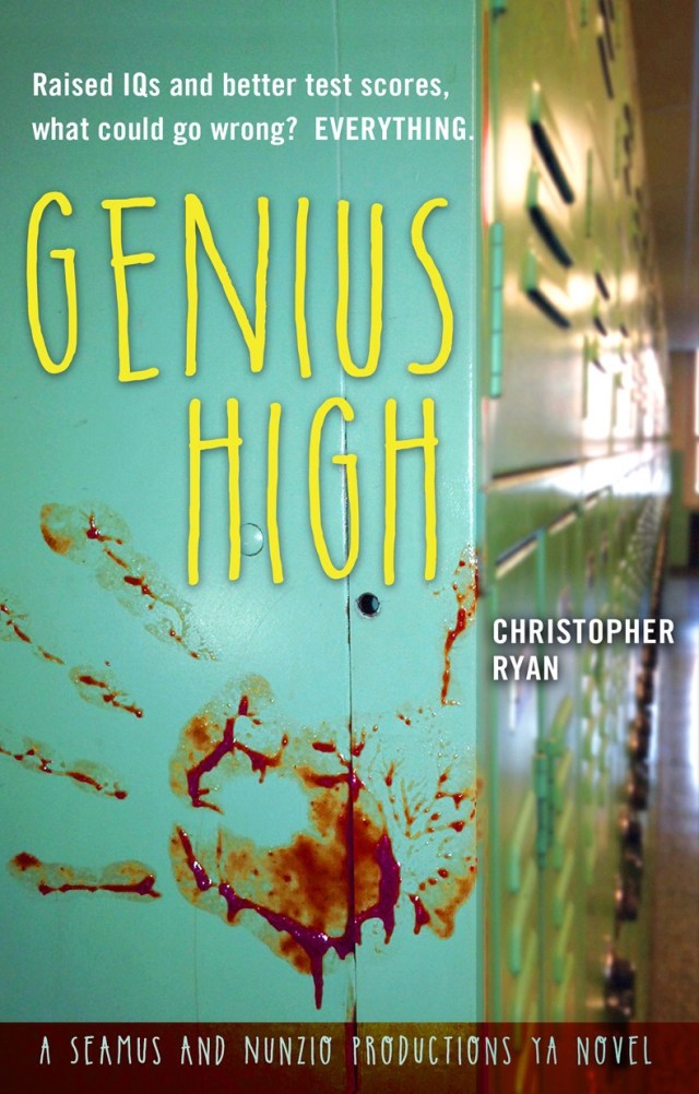
The color scheme and logo changed, the tag line placement shifted, “Everything.” became “EVERYTHING.” and suddenly, there was no other choice. This cover works better than the original concept, and it is important to be open to the possibility that yours might not be the best idea. This version looked right, and to test this, I showed some students. They voted for this one 16-3-1 (the three abstained).
So we’re done, right?
Nope.
A rising pop culture non-fiction writer and friend, Caseen Gaines (who is about to publish WE DON’T NEED NO ROADS- The Making of the Back to the Future Trilogy), gave some critical feedback on the front matter, rewriting it to read:
“Raised IQs. Higher test scores. What could be wrong?
EVERYTHING.”
His changed “go” to “be” intrigued me, and I wrestled with the two versions for a long time, finally seeing that “be” has wider moral implications that “go” and I wanted those implications, they gave a better hint as to the themes of the novel.
He also said he “liked the red banner at the bottom but I don’t think I’d put Seamus and Nunzio Productions on the front. It’s wordy, and I don’t usually see a publisher’s info on the front cover of a book prominently displayed like that. I’d replace the text with “A YOUNG ADULT NOVEL”.
Gaines was right again.
The challenge here is to take feedback objectively rather than personally. Even though the front matter was my writing, both of Caseen’s suggestions improved the look of the front cover. Always go with good advice! When I asked Liz, she agreed. So, the front is getting a “rewrite”.
Book covers are key to sales, so apply every “let it suck” lesson you know toward honing the image and messages on front to the very best they can be. Rewrite, redesign, simplify, clarify, and beautiful. That’s how your cover will go from suck to success.
(When the back design is done, I’ll tell that tale as well.)
Keep writing and rewriting, brothers and sisters!
</ Ryan is author of City of Woe, available on Kindle and in print. For more info, click here.<
